UX & UI - designing the best design system
What’s involved in creating an effective Design System and what are its benefits?
The aim of a ‘design system’ is to create consistency and uniformity in the look & feel of an application through a set of reusable elements that look as if they belong to the same family.
Design Systems for UX & UI have been around for quite a while; originating as style guides and brand manuals, their earliest digital manifestations were CSS frameworks like the popular Twitter Bootstrap, which provided a set of UI elements such as typography, buttons and dropdowns.
Atomic Design methodology introduced a more systematic approach and the patterns and guidelines of Google Material Design have been widely adopted.
The hidden layers
“A Design System is the official story of how your organization designs and builds digital products.” - Brad Frost
But the best Design System are more than their immediately visible components: the UI toolkits, UX patterns, the accessibility guidelines. Behind these elements there are also the invisible layers, such as the processes and governance model.
Although they may not be visible in the platform output, they are essential parts of the system. They define how people work and communicate, they describe the procedures for reviews and feedback and how new patterns are approved. It’s about “how we design” at Eidosmedia.
Good UI & UX design - a group creation
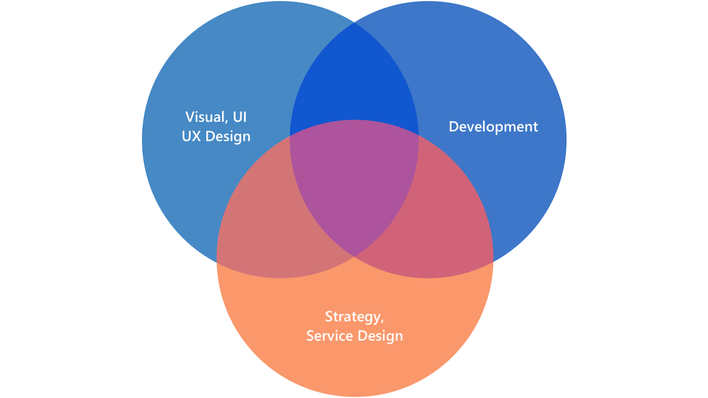
The creation and maintenance of a Design System brings together different skills (visual UI and UX design, development, strategy, business and services). It involves different stakeholders too: the company and its teams, the individual users of the system (PO, UX, UI designers, developers) and, of course, the end-users - the people who use the digital products, the final output.
“A Design System isn’t a Project. It’s a Product, Serving Products.” - Nathan Curtis
To work effectively, the best Design Systems need constant maintenance, they're living things. The real challenge is approaching them from this perspective.

Making the Eidosmedia Design System
We began by creating comprehensive style guides for each of our products. After the style guides were done, we could move on to include guidelines, principles, and rules. At the same time, we started redesigning each of our components using the vector graphics editor Sketch, keeping in mind that we were designing a cross-library of elements for use in both the Windows and the Web versions of our products. We then used the development environment Storybook to manage our documentation.
We created detailed rules with “do” and “don’t” examples for each design pattern. The aim was to give people a clear idea about how to reuse these components. We described in which situation and under which conditions, designers should use which design pattern.
At the end of this process, with the collaboration and support of the Tech teams, we were able to put it all together in Storybook: a complete library of React components, UI and UX guidelines, templates and detailed documentation.
(You can access and browse the library at: https://design.eidosmedia.sh/)
The Tech teams also added some plugins like Knobs and Accessibility that allow designers to test their components from a functional and accessibility point of view.
The benefits of the Design System
The Design System has created significant improvements across the entire development cycle:
- Brand identity - We achieved the goal of creating a consistent visual identity for the company’s products across all platforms.
- Faster releases - Today we’re able to build and ship things faster than we used to. The quality of the shipped product has increased while the time taken to ship has been drastically reduced.
- Easier design and coordination - It’s become a lot easier to create, share and synchronize an extensive set of components at a much faster rate. Also, going forward it will eventually help us in easy knowledge transfer to new team members.
- Clean coding - The component library helps developers maintain clean coding and consistency in the final product.
-
Usability - our end-users learn faster and work better using our products.

